Product pages are webpages designed to sell products online. They typically include an image, description, price, and “Add to Cart” button.
But a lot more strategy goes into the best product pages.
Check out 17 inspiring product page examples (in no particular order). We’ve included top brands like Amazon, Apple, and Nike so you can learn what the best ecommerce websites do.
Then, learn how to implement best practices in your own designs.
1. Amazon // Provide In-Depth Information
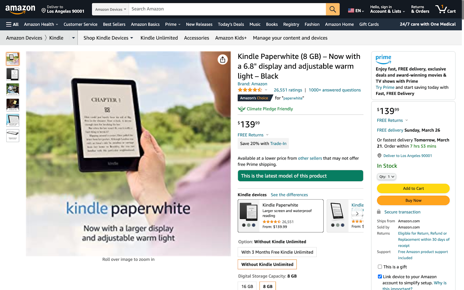
Amazon is the most visited ecommerce site in the U.S. Its product page design isn’t pretty, but it works.
In this example, a descriptive product name highlights key features. Helping the page stand out and attract clicks in search results.
Note: Selling products through Amazon? Semrush’s Amazon marketing tools can increase your listings’ visibility and conversions.
The average star rating and number of ratings are prominently placed. Amazon understands these metrics are crucial for building trust.
(In a U.S. survey, 98% of respondents said reviews are an essential resource when making purchasing decisions.)
Images show product benefits in action. While overlay text provides context.
Here are some other beneficial features you’ll find on this product page:
- “#1 Best Seller” label to evoke fear of missing out (FOMO) in shoppers
- Sustainability information to reassure eco-conscious consumers
- Review videos from third-party creators such as Pocket Lint
- Skimmable list of key product benefits
- Full breakdown of product specifications
- Customer questions and answers
- Comparison table featuring other models
- Links to related products
Key takeaway: Amazon’s busy product page design won’t work for every product website. But it shows that consumers are eager for information. Test various formats to cater to your ideal shoppers.
2. Apple // Direct Shoppers to the Checkout
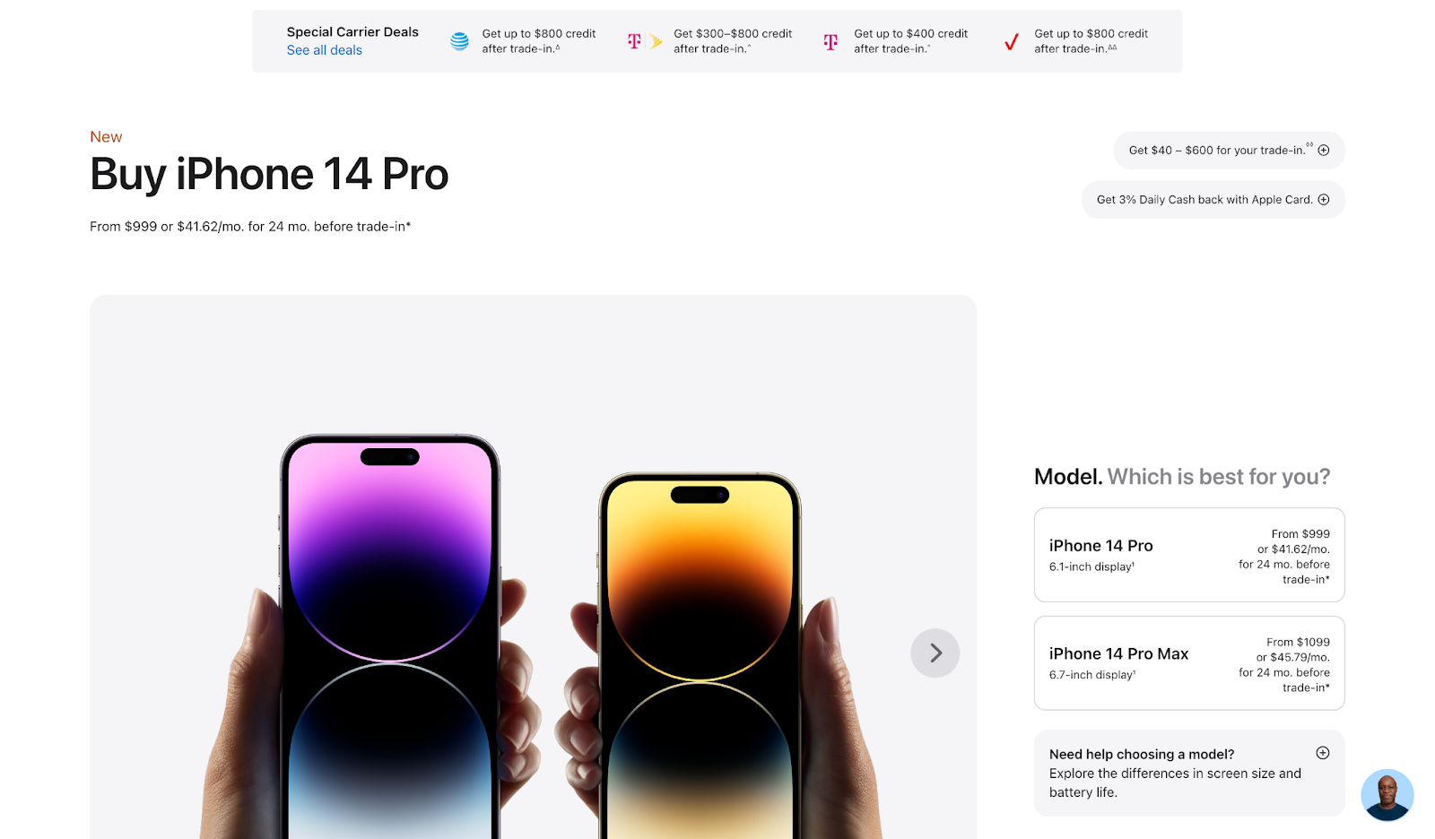
Apple is known for its sleek, minimalist aesthetic. Its product page designs are no different.
Consider the iPhone 14 Pro product page. The clean design puts the product photo front and center. And directs shoppers to make their selections.
Rather than having separate pages for each model, color, and storage combination, Apple brings all the options together in one place. To improve the user experience (UX) and make shopping easier.
Notice the emphasis on pricing: Apple has other landing pages focused on the product’s benefits and specifications. This one is tailored to people who are ready to buy.
The “New” label at the top capitalizes on people’s desire to snag the latest model.
Live chat allows the company to answer questions quickly. Reducing the risk of customers leaving at this crucial stage.
Key takeaway: Direct your users’ attention to the next step. Whether it’s adding a product to their basket or making a color selection.
3. Gymshark // Keep Users On the Page
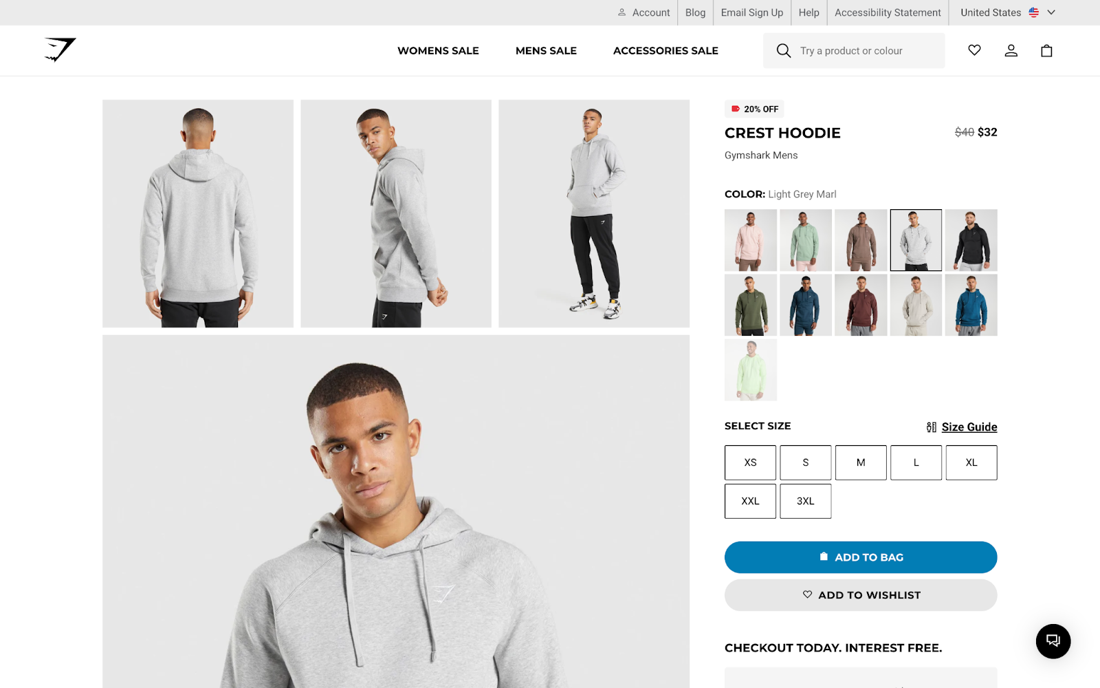
One of the biggest issues with buying fashion online? You can’t try on the outfits.
Gymshark provides a variety of model photos to help shoppers visualize clothing on themselves. Making sure to cover every color variant.
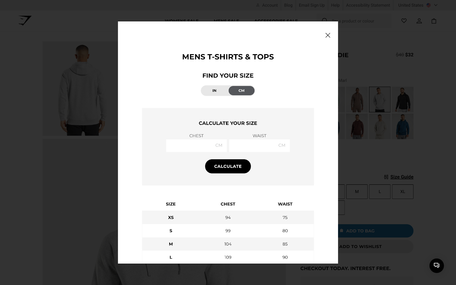
Plus, an interactive size guide helps shoppers find the perfect fit.
Although the “Add to Bag” button stands out most on this product page, there’s also an “Add to Wishlist” option. This accommodates shoppers who want to shortlist items or purchase later. Meaning they’re less likely to forget about something that piqued their interest.
Gymshark could even send these users an email reminder.
Key takeaway: Provide all the information shoppers might need right on your product page. Don’t direct them elsewhere and disrupt their journey.
4. Leesa // Build Trust with Reviews
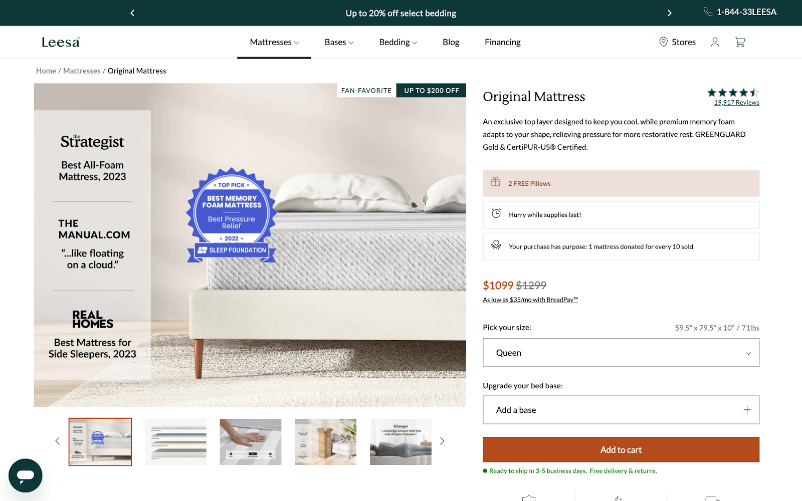
Online shoppers can’t lie on a mattress to see how it feels.
Ecommerce brand Leesa navigates this issue through copywriting. For example, it says the product “adapts to your shape” and sells benefits such as “restorative rest.”
Social proof is important, too. Leesa prominently displays customer reviews and industry accolades on or near the main product photo. To reassure shoppers they’re making a smart purchase.
The product page also advertises a $200 discount and monthly payment option. Making the large price tag seem more manageable.
Key takeaway: Customer reviews and industry accolades can build trust and convince customers to buy.
5. Anova // Speak to Your Target Audience
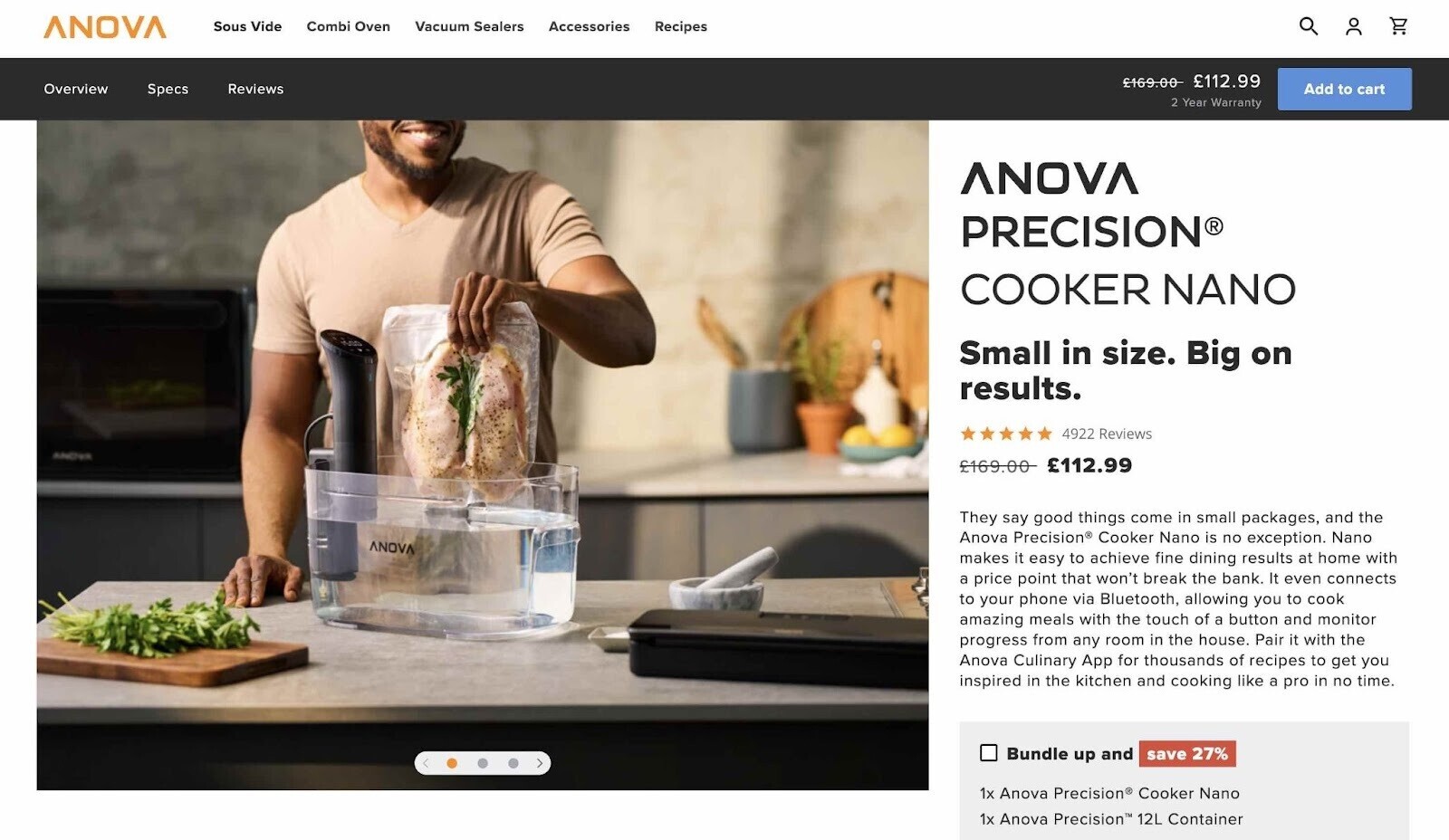
Anova’s precision cooker is aimed at cooking enthusiasts. And the main product photo makes this clear upfront.
The company also uses phrases like “fine dining” and “cooking like a pro” to engage their target audience.
Further down the product page, highlighted features with supporting lifestyle images help shoppers visualize the product in their own kitchens.
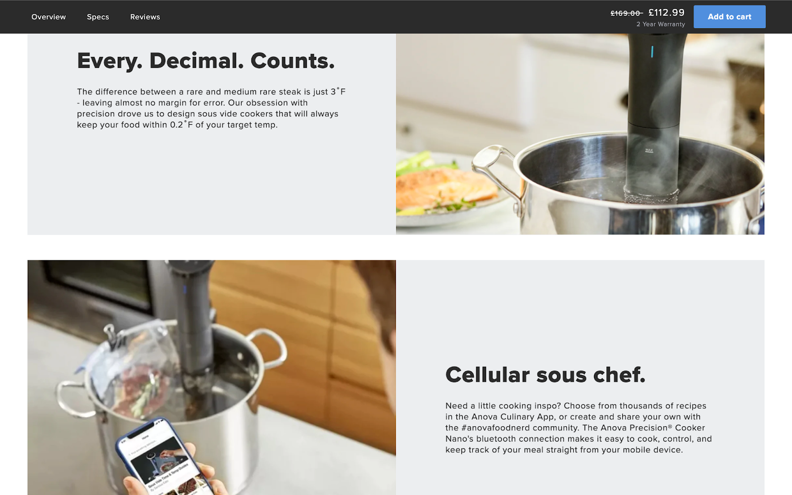
Notice how the “Add to cart” button follows users down the page. Users don’t have to scroll back up once they’ve decided to buy.
Key takeaway: Tailor your product page to your target audience’s desires and pain points.
6. The Ordinary // Make Information More Engaging
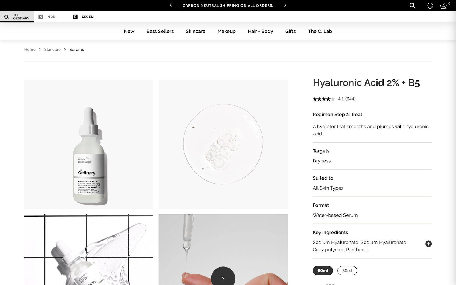
The Ordinary’s scientific approach to skin care is reflected in its product page design. The spacious, white layout is reminiscent of a laboratory. While an emphasis on ingredients lends extra authority.
Further down the page, reference to a clinical study provides a level of credibility that’s valuable in the skin care industry.
And this table enables shoppers to digest key information quickly:

The Ordinary educates shoppers on using the product in its “How to build a skin regimen” section. This also allows the brand to promote related products.
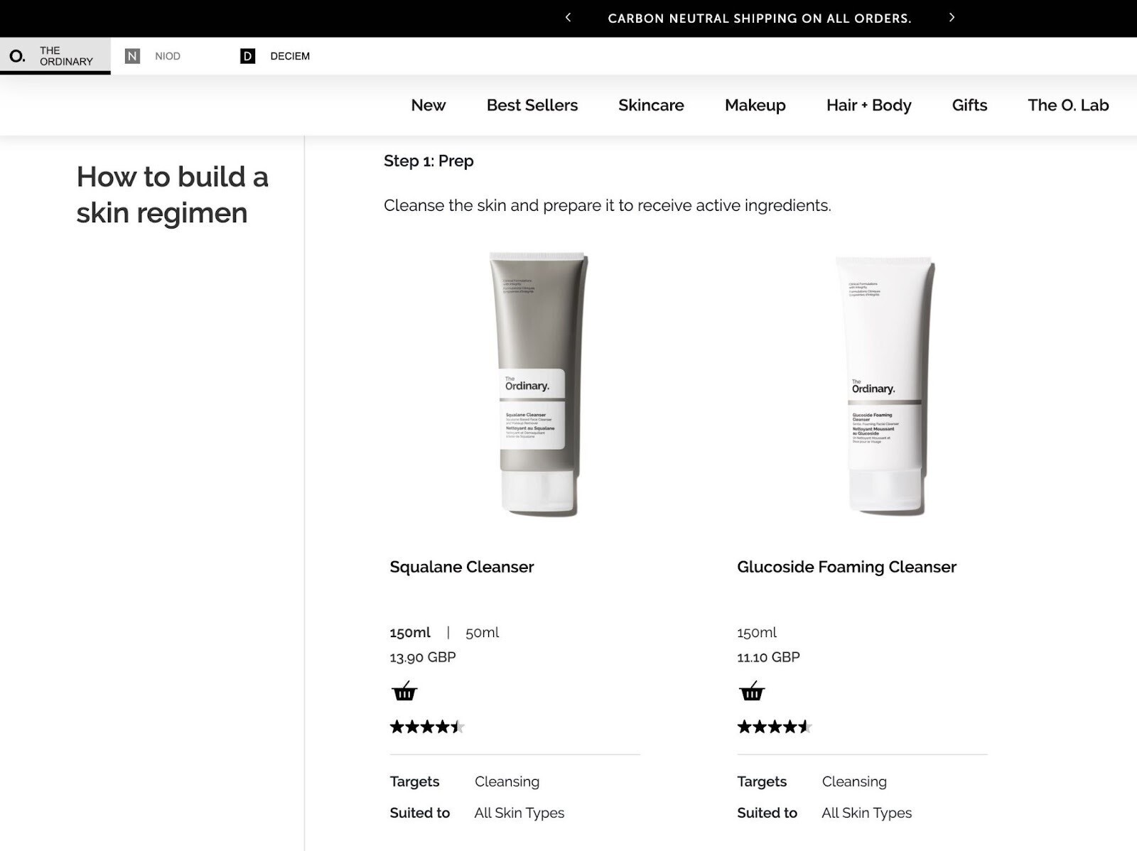
Key takeaway: Creative design allows you to present information in digestible and engaging ways.
7. Boohoo // Ensure Key Elements Stand Out
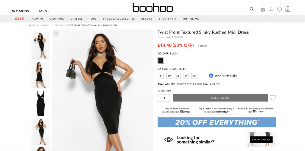
Notice how much the product price and “20% Off Everything” banner stand out on this Boohoo product page.
The online fashion brand is known for its sales and discounts. And it’s not afraid to emphasize them. It also offers a variety of pay-later options to convert budget-conscious shoppers.
Although Boohoo is a fast-fashion brand with constantly rotating stock, it invests in high-quality product photography. Complete with modeling. Because it recognizes that aesthetics are a customer priority.
The “Looking for something similar?” section provides recommendations if the shopper’s size is out of stock or the design isn’t quite right. Increasing the chance of conversion.
Key takeaway: When you step back from your product page design, the most important elements should stand out immediately.
8. Kombu // Dare to Be Bold
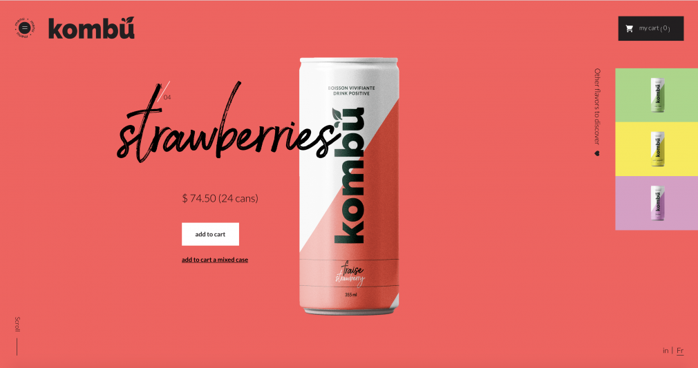
Beverage company Kombu’s bold design proves you can ditch the standard product page layout.
Kombu visitors have likely already tasted the drink and want to order in bulk. So there’s no need to “sell” the product through elaborate descriptions and lifestyle images.
The company can focus on delivering a unique UX. One that strengthens the brand image and keeps shoppers returning.
Key takeaway: Dare to be bold and do something that stands out if your brand allows for it.
9. Target // Add User-Generated Content
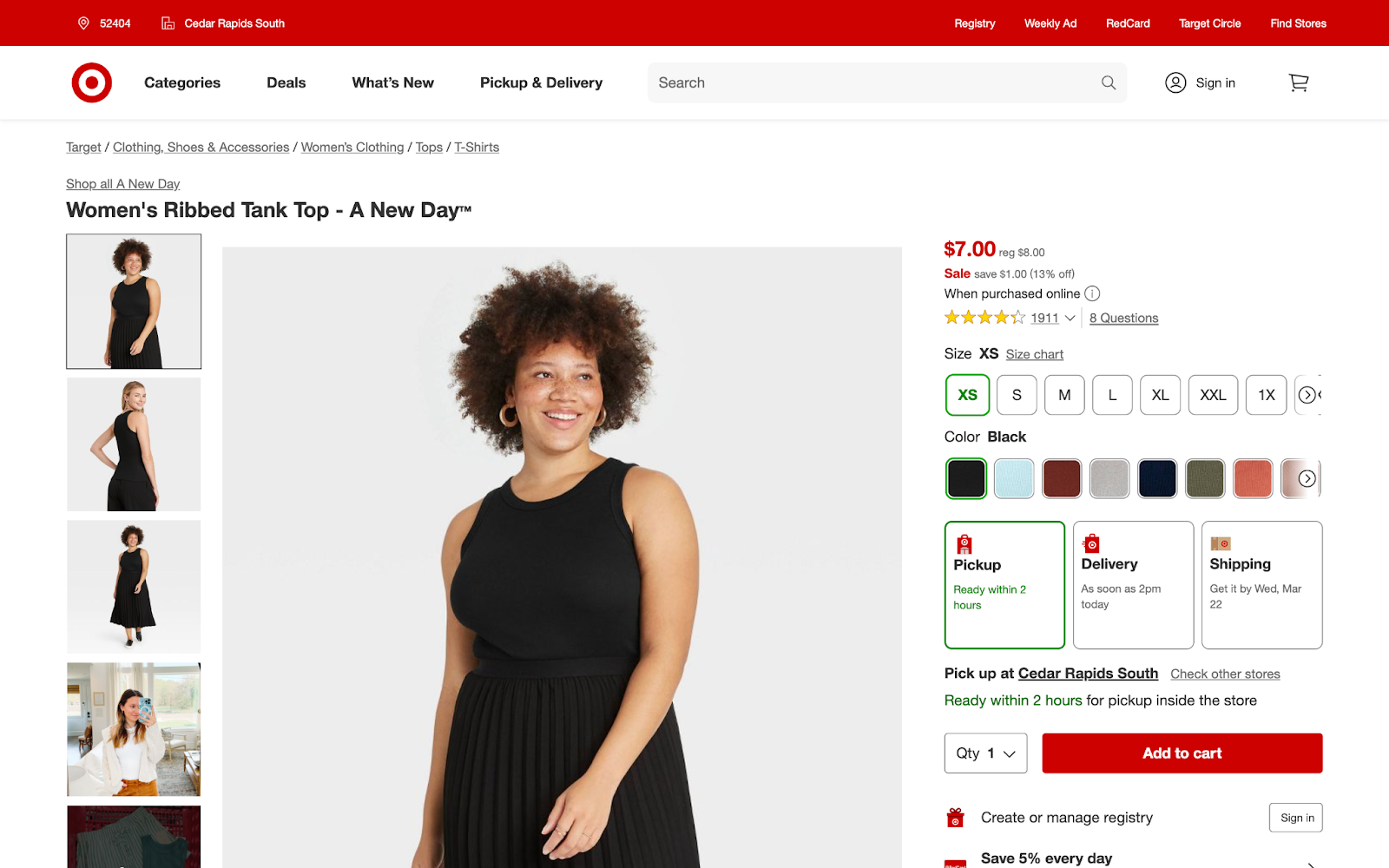
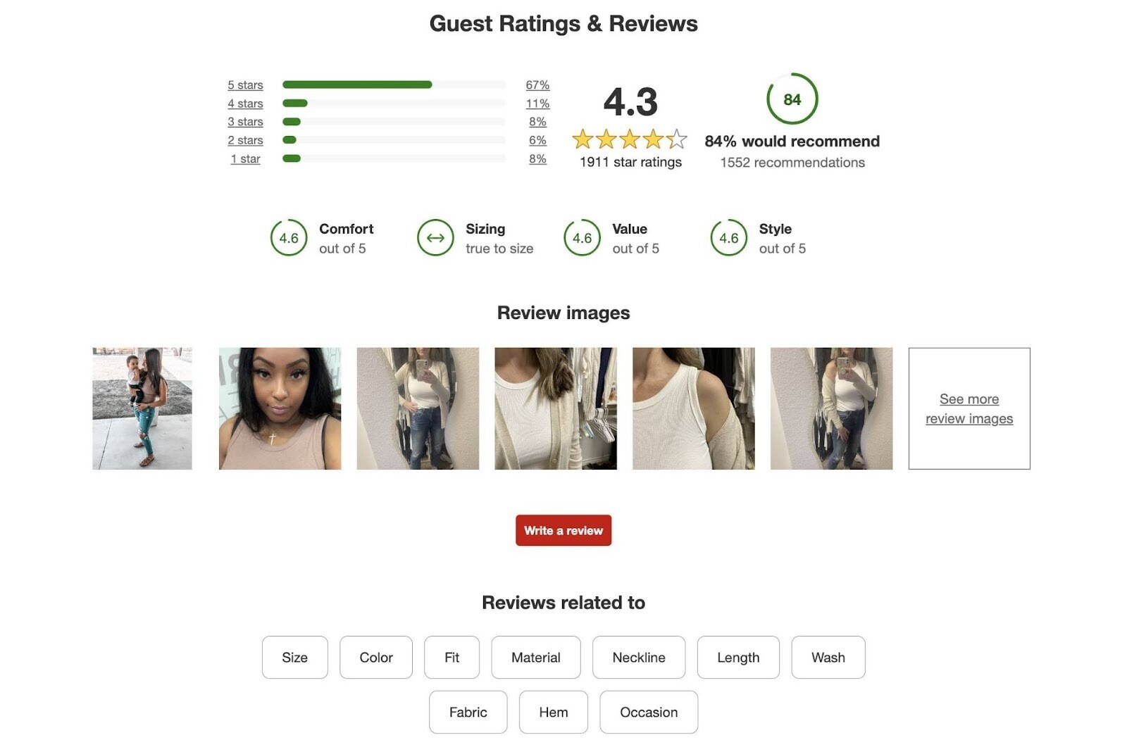
Target provides clear stock information and delivery estimates to help shoppers choose between fulfillment options.
Its product pages also capitalize on user-generated content. When leaving a review, Target customers can do the following:
- Provide specific ratings for comfort, value, and style
- Let future shoppers know whether an item runs true to size
- Share their own photos
Target customers (alongside staff) can also answer user questions.
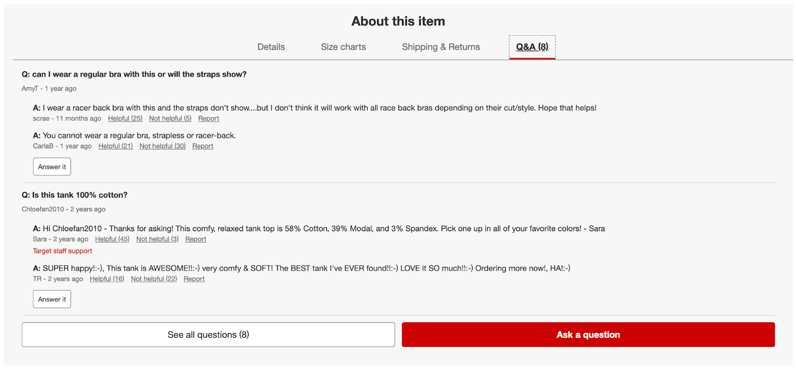
This builds trust and presents the consumer with ample information throughout the purchasing journey.
Key takeaway: Build trust by adding user-generated content.
10. Barner // Replicate In-Store Experiences
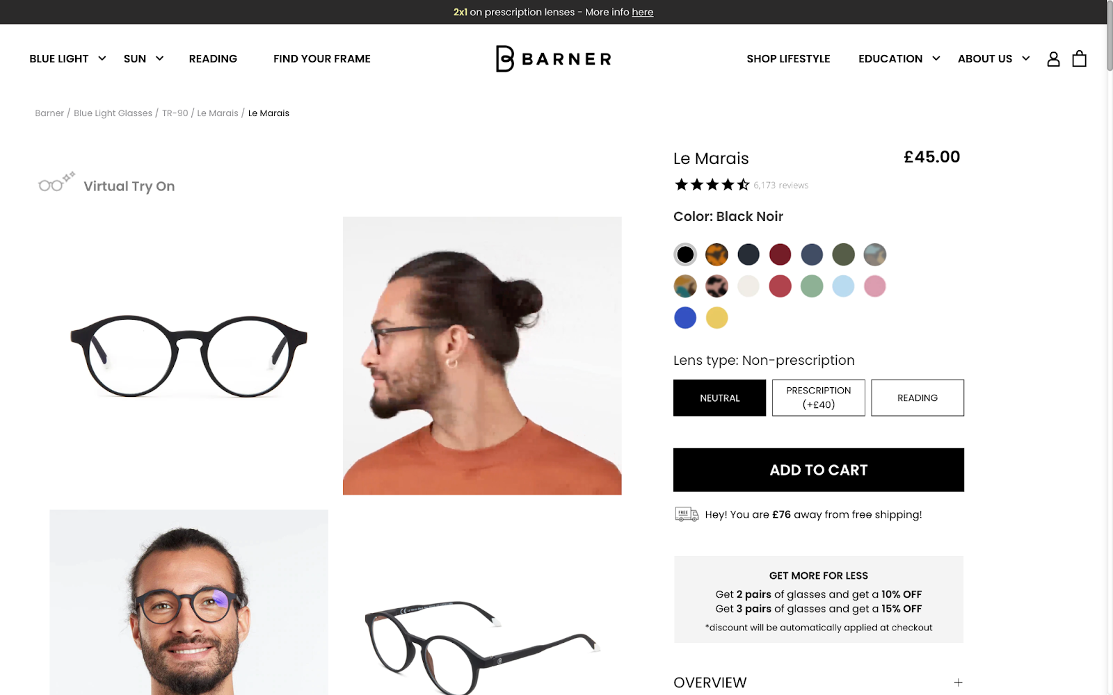
Barner uses a variety of product photos and an animated GIF to give shoppers a holistic view of its glasses.
Then, interested shoppers can use the “Virtual Try On” feature to recreate the in-store experience. This creative approach can help the brand maximize sales and minimize returns.
Barner also uses a couple of interesting upselling tactics in this product page example:
- Minimum purchase for free shipping
- Multipurchase discounts
Key takeaway: Think about in-store shopping and upsell experiences. And consider how they can translate to your product website.
11. Silver Cross // Resolve Audience Objections
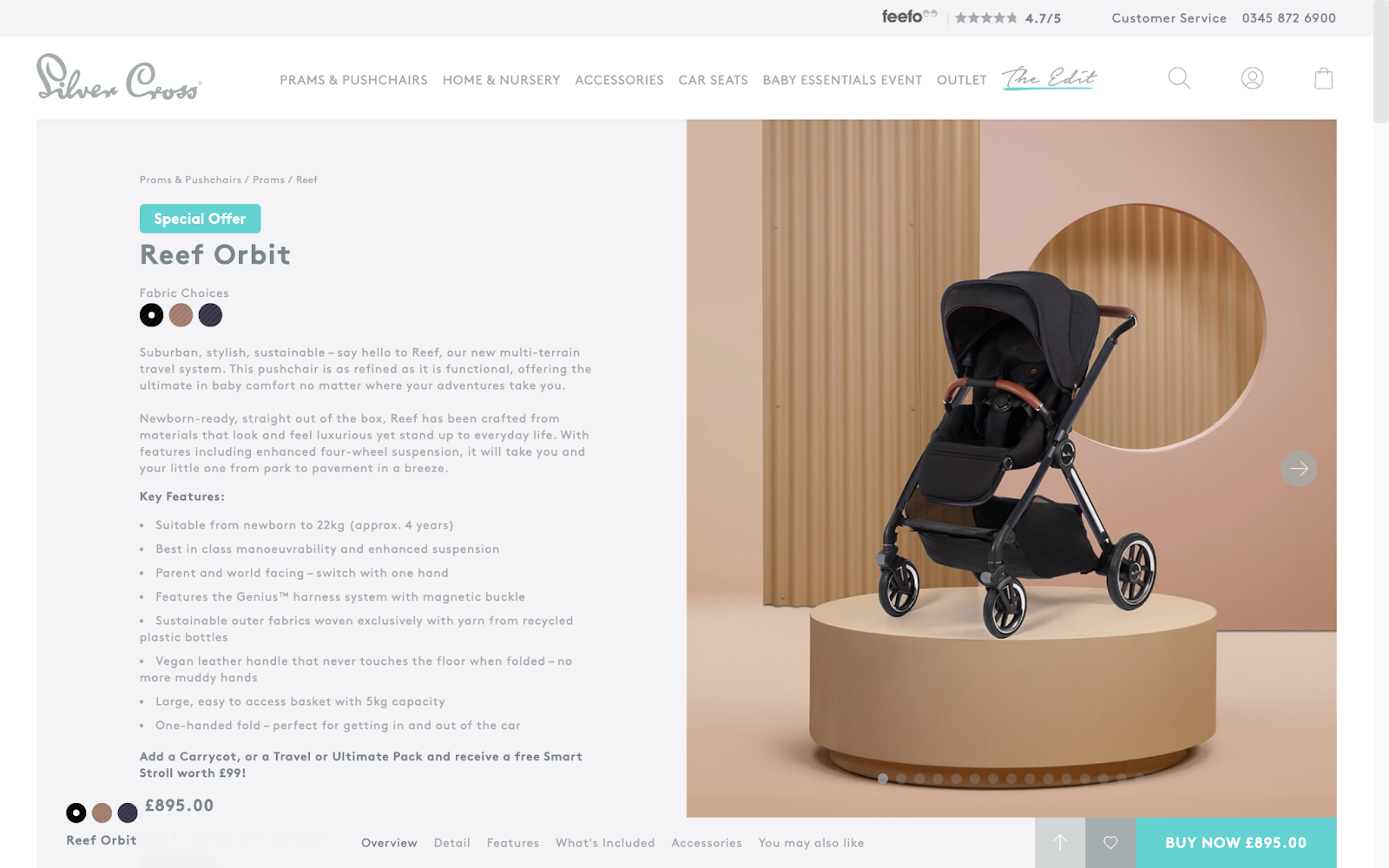
Expectant parents have many questions when buying a stroller. Silver Cross works to answer them in this product page description.
Most of that information happens above the fold (at the top of the page, before the user scrolls). Which works to quickly capture the audience’s attention.
Then, the company focuses visitors’ attention on the next step. The “BUY NOW” button features a high-contrast color and follows the user down the page.
Key takeaway: Resolve your audience’s objections within your product page descriptions. Address questions that might otherwise hold them back from purchasing.
12. Garmin // Prioritize Above the Fold
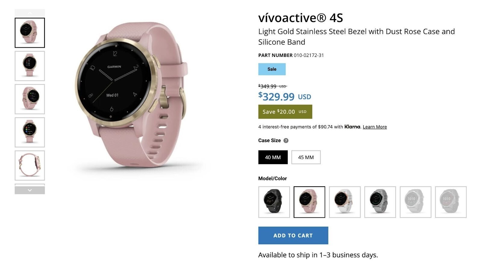
Many people research big-brand products on third-party blogs, review sites, and other sources. By the time they reach the product page, they’re ready to start the transaction.
That’s why Garmin’s product page focuses on elements like price, size, and color—things that matter toward the end of the buying journey.
But indecisive shoppers aren’t left behind. Specifications, box contents, and compatible devices are listed below the fold. Along with other useful information.
Key takeaway: Consider the inverted pyramid approach for your product pages. Start with the most essential information above the fold; then provide more detail below.
13. REI // Provide Great Mobile UX
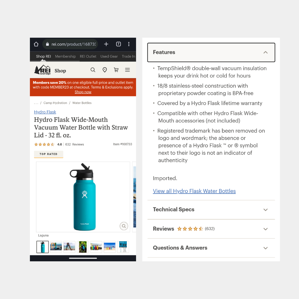
REI has the best product pages for mobile UX, according to research firm Baymard Institute.
Here are some reasons it scored well:
- Collapsible sections prevent unnecessary scrolling
- Cross-sell (i.e., “People also viewed”) sections are placed at the end
- Product variations are linked
- Product videos are presented as part of the image gallery
- Product prices are highly visible
Key takeaway: Many consumers use smartphones to shop online. So your product pages need to look and work great on mobile screens.
14. Zara // Get Creative
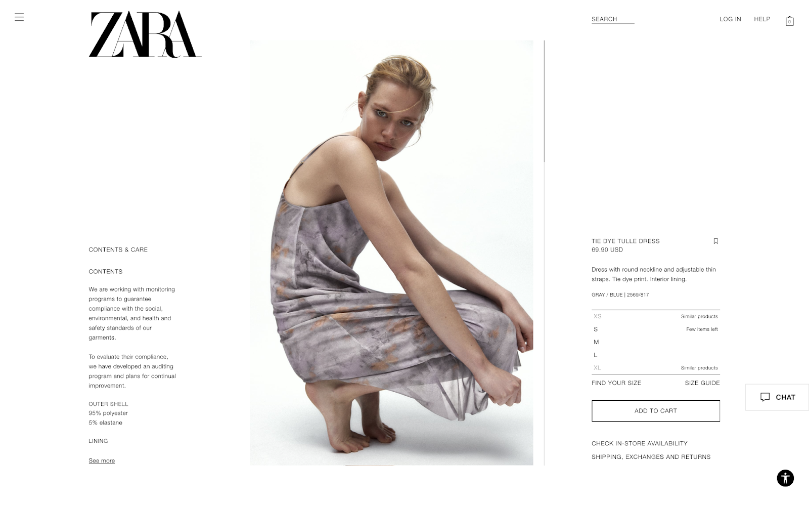
Zara’s online store has short product descriptions. It lets dramatic images do the talking.
Unusual model poses help the brand capture online shoppers’ attention. And give their products a high-fashion feel.
This approach has even earned Zara some free publicity.
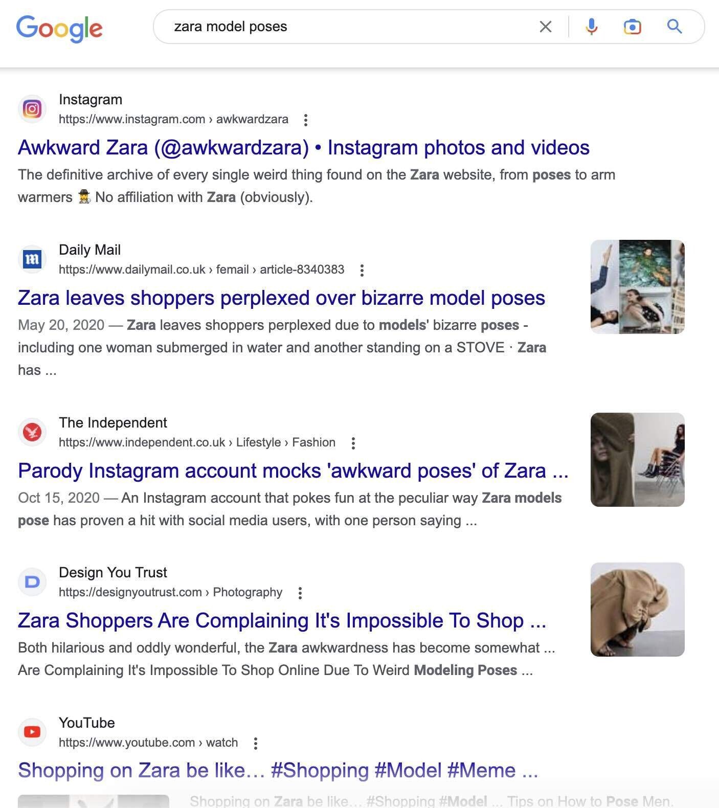
Key takeaway: If you have limited flexibility with your product page layout, try a creative approach with other elements. Such as photos or text.
15. Firebox // Create a Sense of Urgency

Firebox is a place for users to “shop for the unusual.” Photos and videos show its products in action, helping shoppers see the functionality of its quirky gifts.
Plus, the site’s humorous copywriting perfectly complements its novelty products.
Firebox product pages highlight stock levels to create a sense of urgency. This can encourage more shoppers to head to the checkout.
Key takeaway: Consider notifying online shoppers of low stock levels. This can encourage conversions. And avoid disappointment when items sell out unexpectedly.
16. Dyson // Highlight USPs
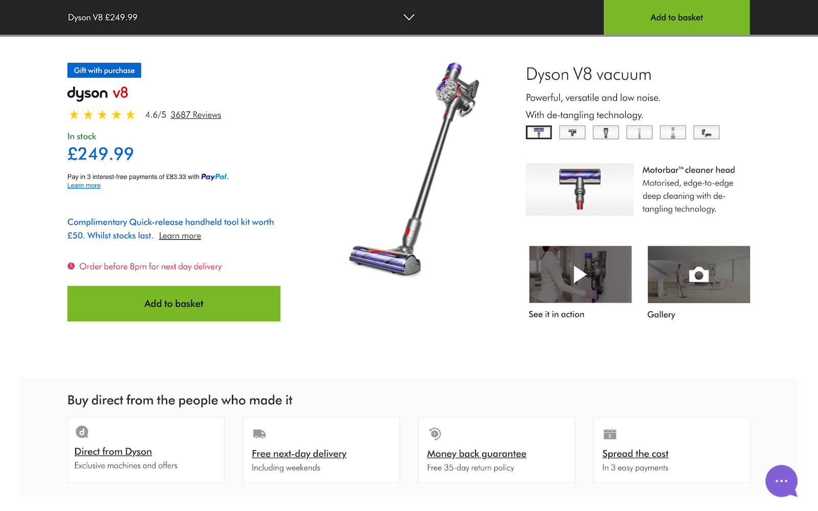
Dyson’s product pages work to convince shoppers to buy direct rather than through third-party retailers.
The “Buy direct from the people who made it” section builds trust. And loyalty. It also draws attention to unique selling propositions (USPs), such as free next-day delivery and a money-back guarantee.
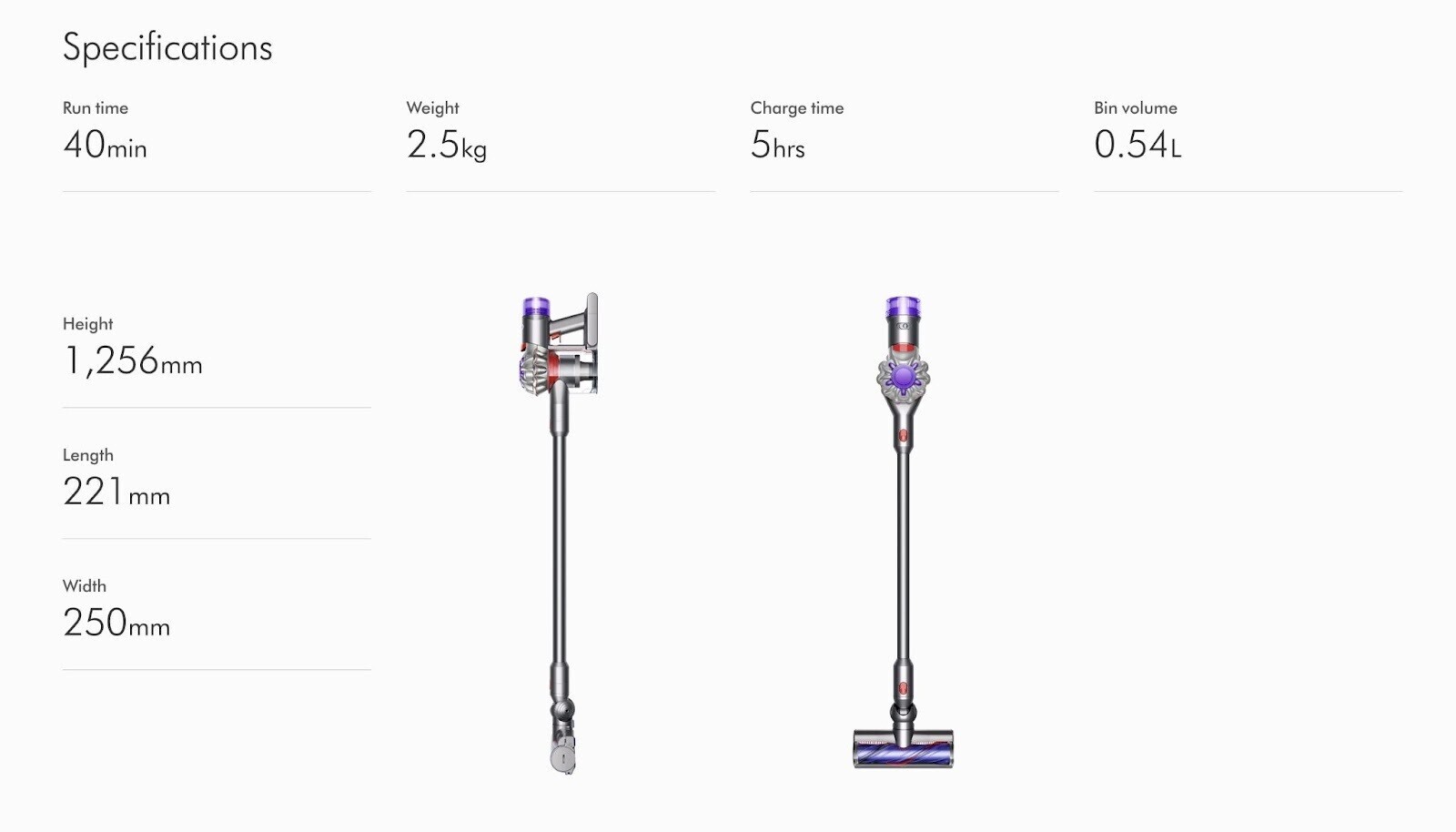
Plus, the brand’s commitment to efficient design is reflected in its product pages. For example, this product specification layout is clear and attractive.
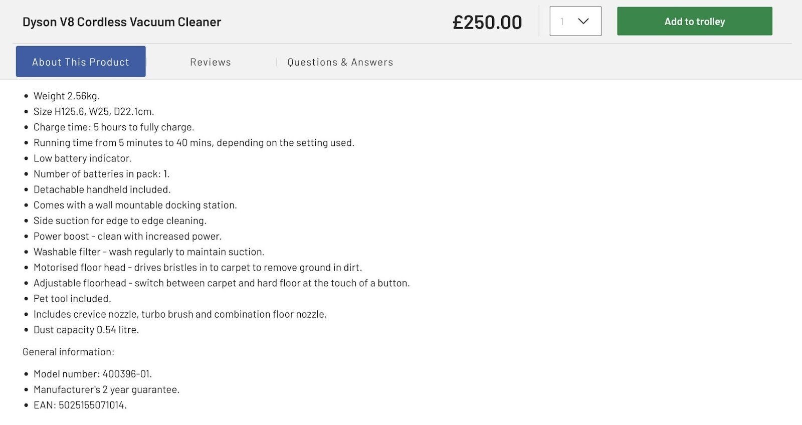
This reseller, on the other hand, displays the same specifications in a less appealing way:
Key takeaway: When your products are available elsewhere, it’s crucial to highlight USPs. And deliver a standout UX.
17. Nike // Promote Related Products
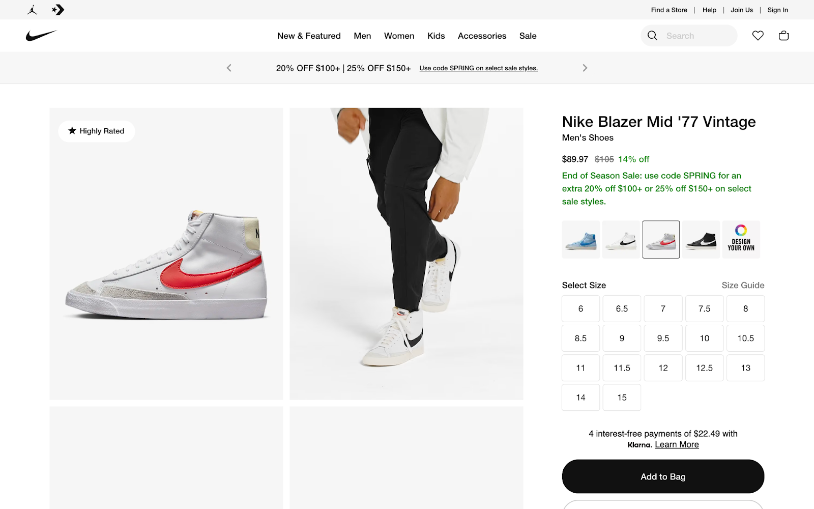
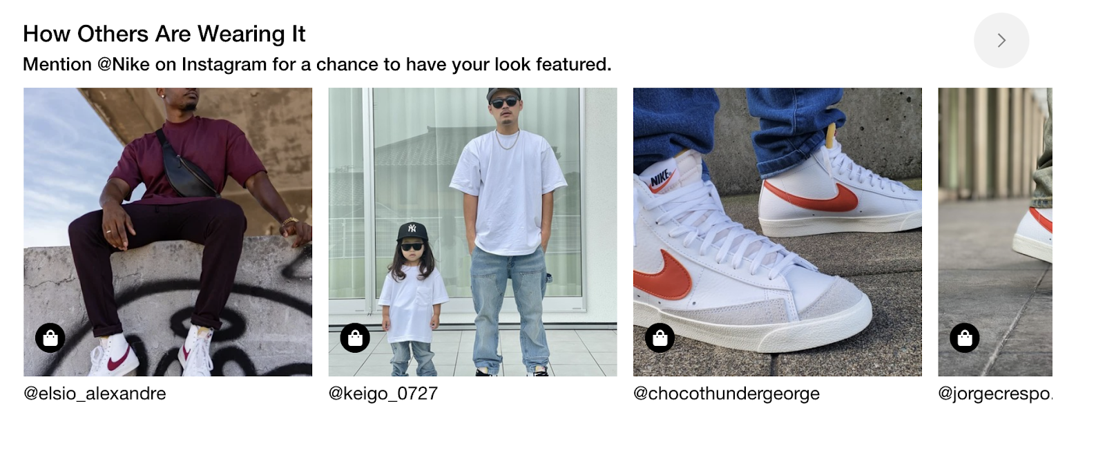
Visuals dominate Nike’s product pages. Up-close product photos showcase details and material types. Model shots give styling inspiration. And user-generated content complements the aesthetic of the page.
A “Complete the Look” section helps shoppers visualize the product in their wardrobes and encourages them to browse other items on the site.
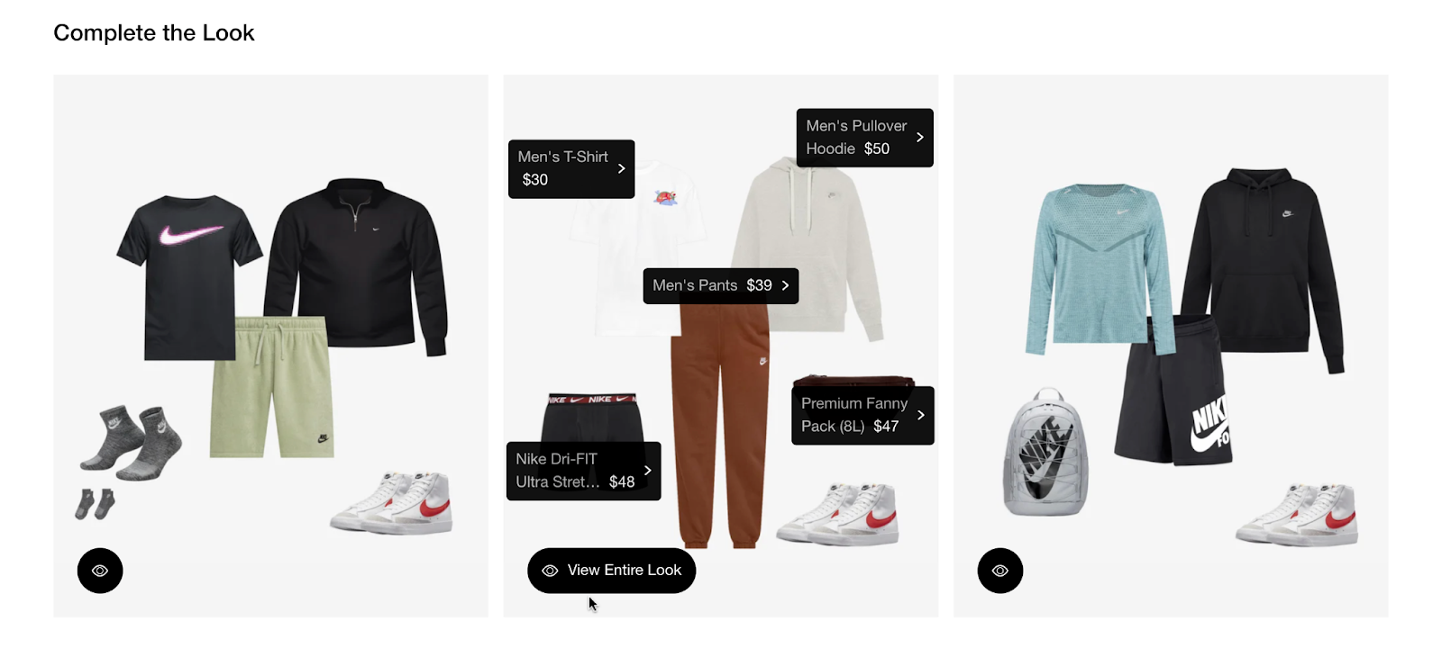
Key takeaway: Promoting related items on your product pages can help you increase average order value (AOV).
Product Page Best Practices
Product page design can make or break your online store.
Ecommerce marketing comprises countless tactics to drive traffic to your product pages. But these efforts are useless if your pages don’t convert.
Below are nine product page best practices that turn more visitors into customers (i.e., improve your conversion rate). To help you create some of the best product pages out there.
Stay on Brand
Your product page design should align with your brand identity—i.e., the personality you want to portray. This will help you engage your target customer and generate repeat business.
For example, creativity and fun are among Lego’s brand values. So its product pages are colorful, whimsical, and inspiring.
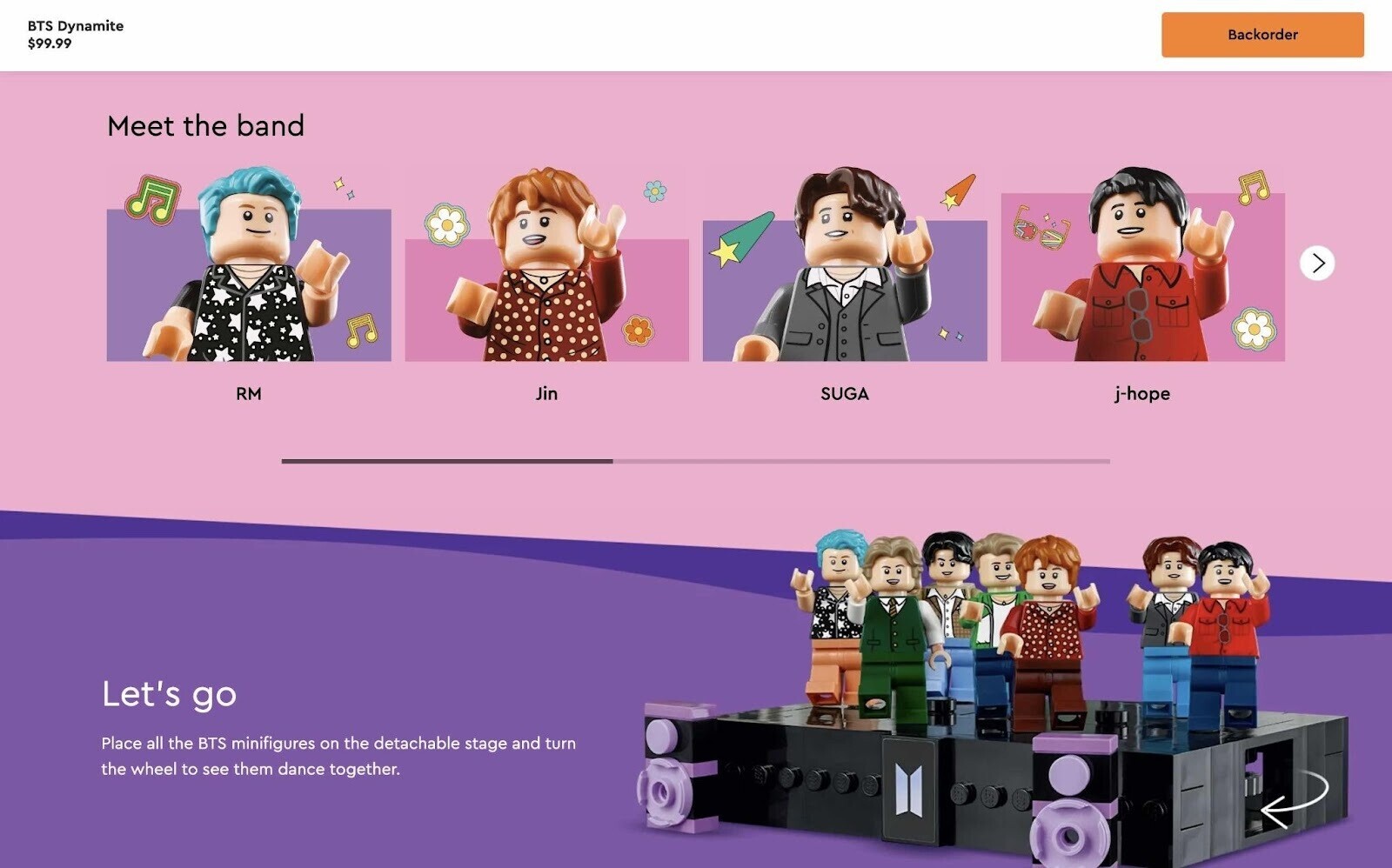
Brand identity can impact everything from your layout to individual word choices. If you need inspiration, look at product page examples from brands you admire. How do they make their personality apparent?
Tip: Learn how to define your brand’s tone of voice with our guide. This is one of the key steps toward building your brand identity and writing copy that converts.
Optimize Product Names and Descriptions
Every product needs a unique and descriptive name. Include this name in the product page’s title (also known as the H1 tag).
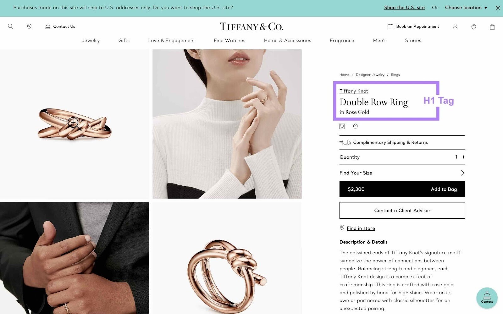
As well as the page’s title tag (the title that appears in search engine results).

This helps ensure your product ranks highly in relevant search results. And attracts clicks from target shoppers.
You should also write an SEO-friendly product description that includes your product name. But it’s more important to focus on persuading customers to convert.
Provide all the details someone might need to make a purchase decision. And tackle objections that might otherwise cause them to leave the page.
Deliver a Quality User Experience
The best product websites deliver high-quality UX on every device: desktop, tablet, and mobile.
This means their product pages:
- Load quickly
- Are visually appealing
- Use HTTPS security
- Make it easy to “add to cart”
- Provide useful and accurate information
- Have a clear and easy-to-navigate layout
- Use clever formatting to make information digestible
Think about the last time you made a purchase online. What went smoothly? What could have been better? Your personal experiences can help you design a better shopping experience for your end user.
Tip: Run your product page URL through Google’s PageSpeed Insights tool for tips on decreasing your page’s loading time. Or use Semrush’s Site Audit tool for help identifying, prioritizing, and fixing technical issues across your site.
Add a Clear Call-to-Action Button
Product page design is all about getting the user to click “buy.” So it’s crucial for the call-to-action (CTA) button to stand out.
Most product websites use an eye-catching background color. And straightforward CTA text, such as “Add to Cart” or “Buy Now.”
Place the button near the top of the screen. Ideally above the fold, so shoppers don’t have to scroll once they’re ready to buy.
Provide High-Quality Visuals
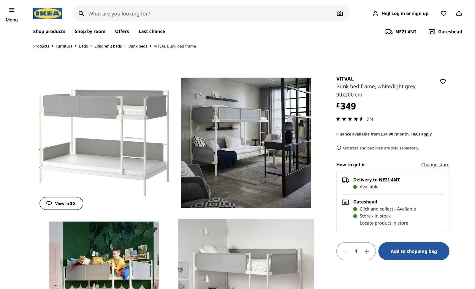
High-quality photos make your products more desirable and help customers understand exactly what they’re getting. They put your products in their best light without being misleading.
Provide large, clear photos shot against blank backgrounds. Making sure to cover different angles and features. You could even use spin photography to provide an interactive 360-degree view.
Lifestyle shots show your product in action. And help shoppers visualize the product in their own lives.
This Ikea product page ticks all the boxes:
Tip: Need to demonstrate complex product features? Try using custom graphics, animated images, or videos.
Display Clear Pricing and Shipping Information
Product page visitors are often in the conversion stage of the marketing funnel—i.e., they’re ready to buy. So it’s important to provide clear pricing and shipping information upfront.
Here are some top tips:
- Display the product price prominently
- Highlight any discounts or promotions
- Advertise convenient payment options, such as Klarna or Google Pay
- Provide delivery estimates and prices
Avoid sending shoppers to other pages (e.g., /shipping-faqs/) for information. This can disrupt the buying process and lead to lost sales.
Build Trust with Ratings and Reviews
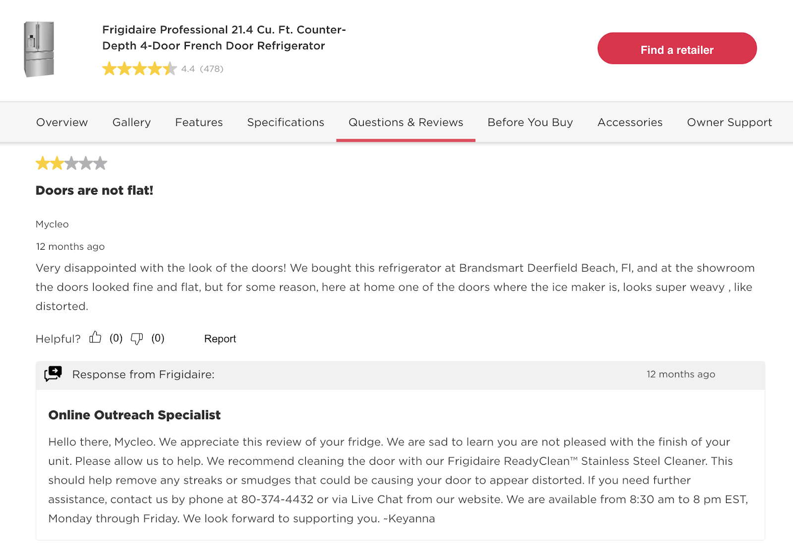
The best product page examples provide customer ratings and reviews. To help shoppers decide whether to buy your product. And whether to buy from you.
So, ask for your customers’ feedback. Then display it prominently.
This could include an average star rating at the top of the page. And individual reviews at the bottom, complete with images, comments, and ratings breakdowns.
Make sure you can reply to reviews, where necessary. This will help you resolve any complaints and protect your brand reputation. Like Frigidaire does here:
Tip: Instill confidence in your customers by advertising any accreditations, accolades, or customer service perks. Let shoppers know your product website is trustworthy.
Use Structured Data
Structured data is information that helps search engines understand webpages better. It uses a markup language called schema.
With product schema, you can tag the following elements on your product pages:
- Average rating
- Image
- Color
- Price
- And more
This can help you secure rich results in Google, which are more detailed and engaging listings.
Like this one from Walmart:
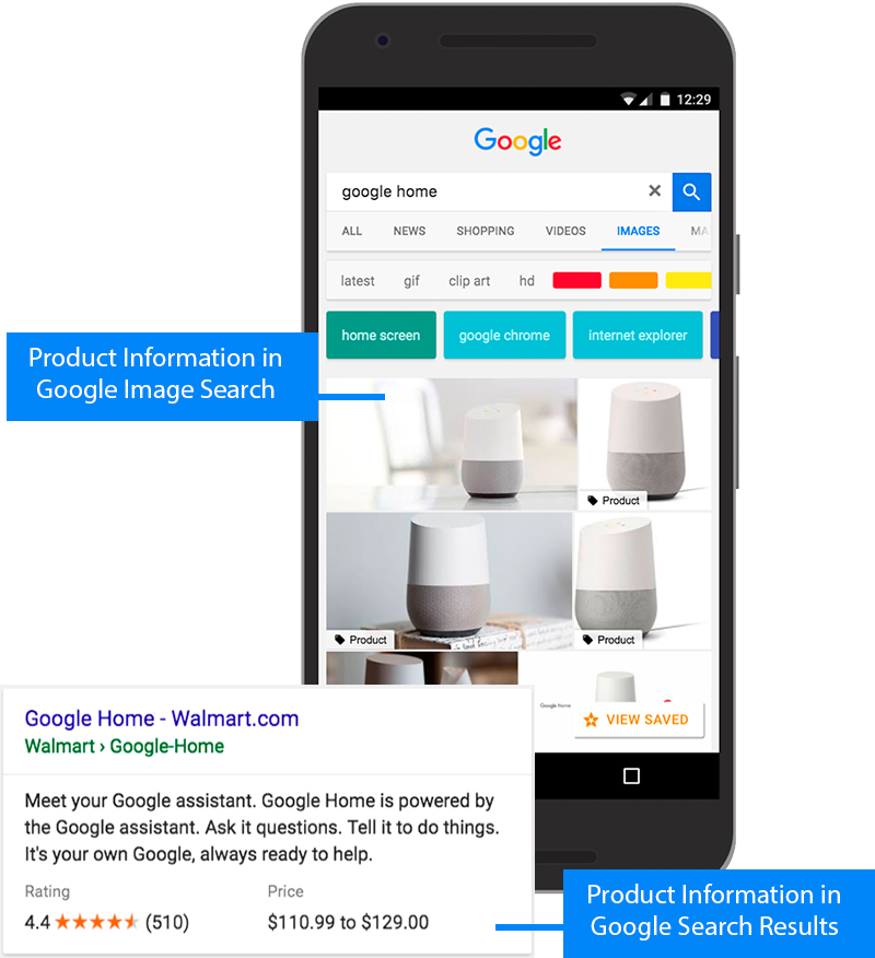
This rich result can help Walmart stand out on the results page and attract more clicks from Google.
Tip: Google offers a Structured Data Markup Helper that can help you apply schema to your product pages.
Make Improvements with Split Testing
The best product pages are often the result of extensive split testing, also known as A/B testing.
It works like this:
- Make a small adjustment to your page, such as changing the color of the “Add to Cart” button
- Serve the new version of the page to half of your site visitors, and the old version of the page to the other half
- After a set period of time, analyze key metrics to see which version performed better
- Apply changes that work and ignore ones that don’t
This data-led approach to product page design helps you identify, test, and apply changes quickly and efficiently.
Tip: With the SplitSignal tool, accurately test how product page changes impact your organic traffic (i.e., unpaid visits from search engines). Without the need for complex development and data analysis work.
Get Expert Help with Product Pages
These product page examples and best practices offer plenty of ideas. But do you have the time and skills to implement them?
If not, turn to Semrush’s trusted agency partners. We partner with web design, web development, and UX design experts who can help you build better product pages. And generate more sales.
Submit a project brief to get started today.
This post was updated in 2023. Excerpts from the original article by Erika Varagouli may remain.
